Ilior is Greece’s first major co-living scheme. Formed in 2018 by Daniel Lyssy, it aims to create exceptional spaces for young and creative professionals who work from home. Ilior One —launched in the centre of Athens— is the first of the brand’s instalments. Indeed, Ilior is in the process of building an ambitious network of plug-and-play spaces and buildings across the nation, that will radically transform the way Greeks live.
We were given creative freedom to brand this unique scheme. Similarly to other Mediterranean South European capitals, Athens is not very familiar with the concept of co-living. With this in mind, we decided to change the subject completely and position Ilior as an imaginary country.
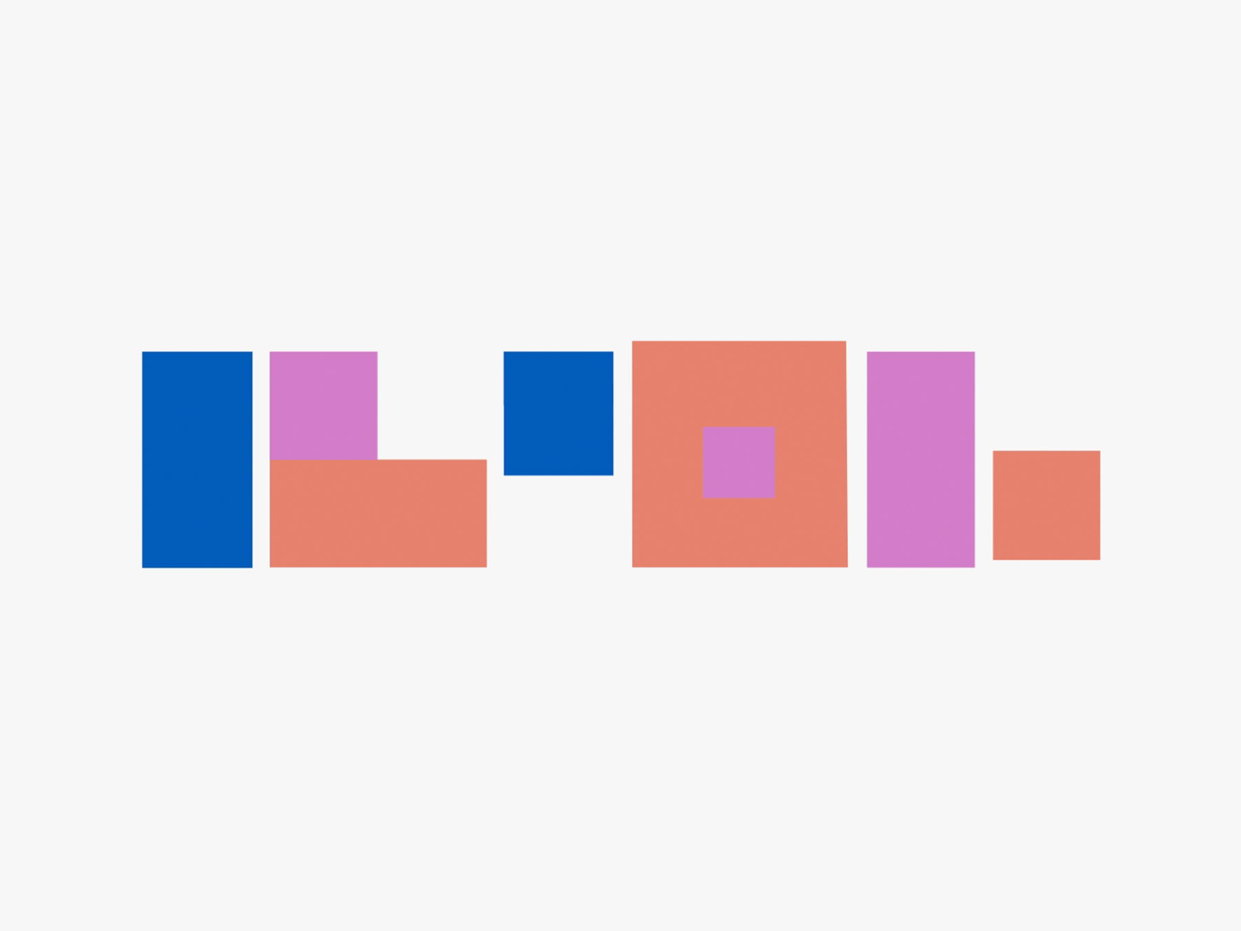
Inspired by the notion that ‘our house is our castle’, we developed an overarching modular and flexible identity system that draws upon the idea of a ‘special place’. For this purpose, a responsive brandmark that references the concept of a flag becomes central to the identity. A flag of an imaginary country where people can dream freely; work collaboratively; debate fruitfully and develop. By drawing upon the flexible architecture of Ilior spaces, the brandmark expands and contracts across different formats, as required. To further illustrate its uniqueness, the colour palette embraces bright pop colours, that no country in the world would ever use for its national flag. This country is entirely imaginary. In fact, that is its strength. Welcome to the land of the dreamers.

In the early 50s, after two world wars and one civil war, the Greek state was effectively bankrupt. On that basis, the Greek government decided to initiate the ambitious Xenia project; a nationwide hotel construction programme aimed at creating accommodation infrastructure. That would set the basis for the development of a tourist industry, to contribute in rebooting the economy. Throughout the 1960’s and 70’s the 59 functioning Xenia Hotels thrived financially. Although widely celebrated for their glorious post-war modernist architecture, they however never had a consistent visual identity. By the 1990’s, after decades of mismanagement, the Xenia project became inextricably linked to the Greek financial meltdown and fell into administration.
By blurring the boundaries between tourism, graphics, and fiction, ‘The fictitious visual identity programme of Xenia Hotels’ is a concept project within which we travelled back in time to create the visual identity of the once glorious, now abandoned Xenia Hotels in Greece. In collaboration with photographer Polly Brown, we created an ambitious image series presenting the imagined brand identity within a past that never happened. In this past, the Xenia hotels flourished; the de-industrialisation of Greece did not happen in the 70s. By the mid-80s the famous Omonia square in Athens was not reduced into a concrete platform and after 2011, 400.000 Greeks never left the country because there was no crisis to escape from. An alternative past has the opportunity to become a brilliant future. Fictitious, but brilliant.
‘The fictitious visual identity programme of Xenia Hotels’ is the first instalment of Time travel branding; a trilogy of concept projects advocating design as a form of speculative research and presented as a series of talks across Europe and the US.

On the occasion of RIBA’s new publishing chapter, Marlon Tate was commissioned to design and art direct the cover of the second edition of ‘Designed to Perform’, a book illustrating practical ways of delivering better energy performance in all types of new build homes.
Written by Sustainability guru and Partner at London architecture powerhouse, Pollard Thomas Edwards, the book introduces readers to the concept of the performance gap and highlights clear issues and solutions to help architects improve their detailing at design stage.

Marlon Tate art directed the record cover and marketing campaign for indi pop star Leon of Athens’ third studio album (EMI). The album, titled’ Xenos’ (greek for ‘foreigner’), features 11 songs echoing the feeling of being a foreigner, a stranger to a new country as well as to yourself. This eclectic spirit was important to convey visually in the artwork, as well as portraying a strong sense of the artist’s personality. The fragmented nature of the market makes it essential that the concept engages across a wide range of formats – print to digital – to create an integrated release and a holistic visual universe.
Our creative concept was inspired Skype and long-distance relationships referencing the need for communication with our external as well as our internal worlds. The album packaging consisted of a sleeve with a die-cut set of multiple Skype windows through which one can see the inner cover of the cd-case with the artist’s face. The campaign included a city-wide out of home roll-out and a website in order to set the conceptual and visual tone, teasing each single through a Skype window.

Marlon Tate designed and art directed the cyberpunk experimental five-track ‘Baby Blues’ EP by Athens-based producer Konstantinos Gkoumas.
Through a blend of buzzing oscillations, blue-collar rhythms, and backwoods synth progressions, the artist’s original intention was to create a Blues record. Instead, he managed to create an EP that redefines the aesthetics of the experimental genre with an amalgam of puzzling downtempo and dark ambient transforming reckless cowboys into knights in shining armour. To dramatise the album’s unapologetic creative recklessness, we created a visual language that’s meant to look like we made it in paint.
To promote the release we expanded our tongue-in-cheek art direction into a series of posters and billboards featuring our MS paint-written scrawl.
Marlon Tate designed and art directed the visual identity and marketing campaign for the Collaborative Unit exhibition series in central London. Initiated by London College of Fashion and University of the Arts London, the series of pop-up exhibitions explored collaboration across artistic disciplines and cultural perspectives. The flagship exhibition, The Future Is Now, took place in Covent Garden and served as the project’s central platform.
The visual identity is constructed around a stark monochrome language, anchored by an italicised serif typeface. At the core of the system sits a bespoke logomark, designed to embody the act of collaboration through formally connected letterforms and shared typographic movement. The identity was developed as a flexible graphic system, capable of adapting across both physical and spatial applications.
The project scope extended across the design of the logo, exhibition catalogues, posters, and environmental graphics, forming a cohesive visual experience across print and exhibition environments.

Ponders End Youth Centre in Enfield, London, provides a wide range of things to do and places to go for young people aged 11 to 19 (or to 24 years for people with a learning difficulty or disability). Inside the building designed by Pollard Thomas Edwards architects, offers activities, including music, sports, dance, film, cooking, art and drama. Enfield Council came to us to help create an engaging identity of the Centre able to attract interest from local youth groups and their families.
Marlon Tate partnered with London-based Pollard Thomas Edwards architects to redefine how a Youth Centre club should look like today. We took inspiration from early 80s and 90s arcade video games (considered by many the exact opposite of a Youth Social Club) and created pixel-inspired supergraphics with coloured tiles for the lower-half of the building’s façade. The concept was to illustrate the range of activities offered inside in a way that would culturally resonate with the new youth community. The tile-based mural represents human figures achieving something worth capturing like tennis players, dancers, drummers and boxers as well as aspirational typographic messages.

Dress For Our Time, by artist and designer Helen Storey, is a public art installation project that uses the power of fashion, science and wonder to communicate some of the world’s most complex issues of our time.
The dress itself is made from a tent (which is no longer in useable condition), gifted to the project by the United Nations High Commissioner for Refugees (UNHCR). In giving the tent a second life, it gives this public art installation an unbreakable bond to humanity and represents the importance of nurturing and protecting all people and safeguarding generations to come. As the gateway to Paris – the city hosting the United Nations Climate Change conference COP 21 – many of the delegates that passed through the station came face to face with the world’s first digital couture dress dedicated to exploring climate change and its human impact.
‘By interpreting the station’s setting as a conceptual border between Britain and France, Nikos Georgopoulos created a polyglot responsive identity that reads the name of the project in English, French and Chinese referencing boarder crossing signs.’
–Art Directors’ Club Journal

We designed and art directed the new visual identity and brand advertising of UDO —an ambitious company specialising in customisable, multipurpose lighting kits and objects that are made with digital fabrication technology and algorithm based design. The new brand identity is centred around a new custom logotype that experiments with the fundamental parameters of letterforms, and references the brand’s algorithmic design process.
Following the successful brand identity, we also created the brand’s website as well as a spin-off publication conceived as a surreal collection of irrelevant information channelling the random and beautiful nature of algorithmic design and UDO objects.

As part of our visual identity and advertising for the MA Show at London College of Fashion, we art directed the exhibition of the MA Fashion Photography. The art images of the students are printed on a spread on a newsprint.
Our collaboration with London College of Fashion continued when the Institution commissioned us to develop a visual identity and advertising campaign for the exhibition LCFMA16, which featured work by the graduating students around fashion and surrounding disciplines. Revisiting the legacy of education as an interactive and dynamic process while also reflecting the influence of technology, our exhibition catalogue for MA Fashion Photography is designed in a way that featured students’ work is intertwined with each other, thus creating a never ending series of new compositions and all possible futures.